Visual Hierarchy
Deseret First C. U.
dfcu.com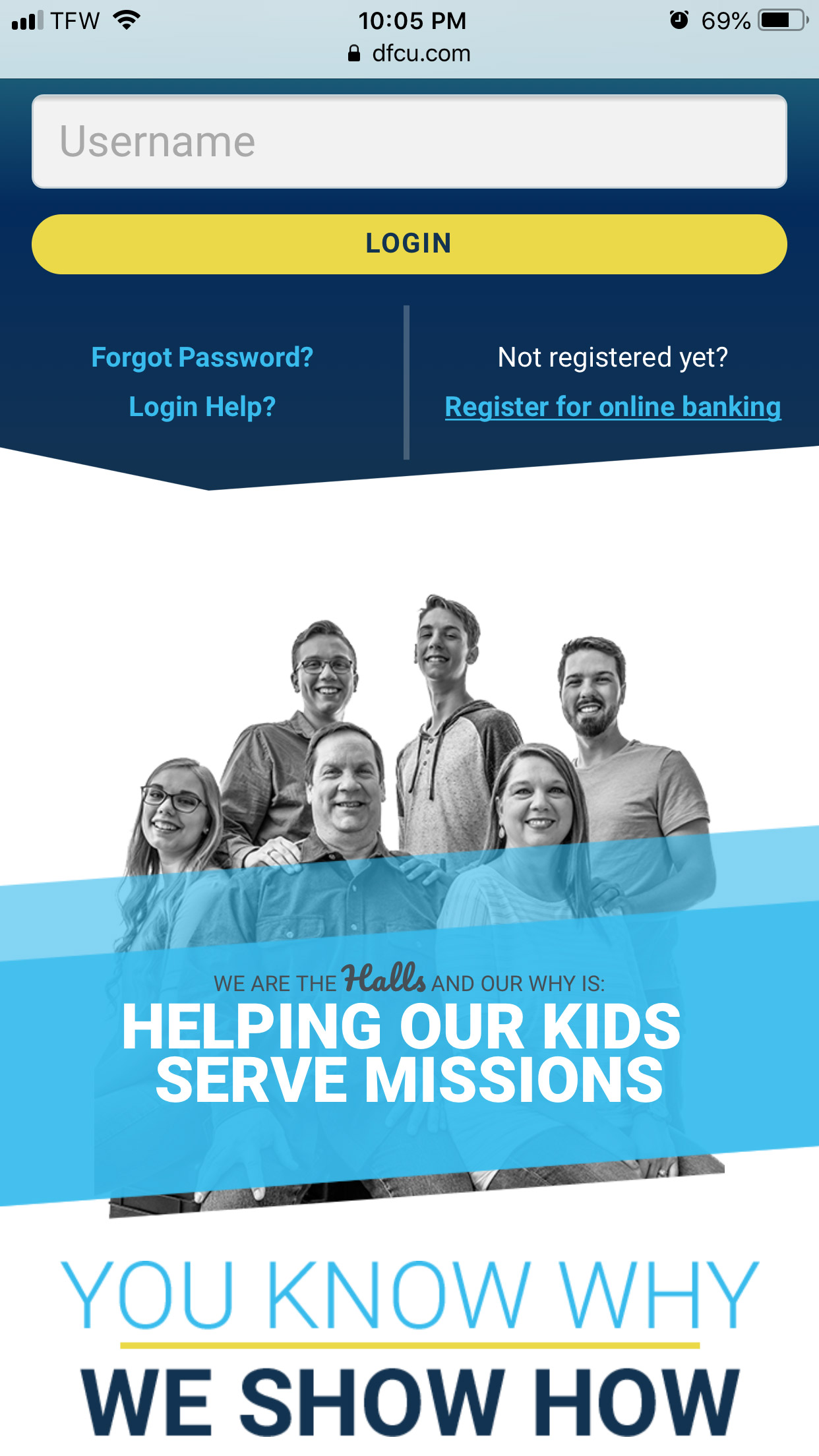
The Deseret First Credit Union website uses visual hierarchy by first drawing the eye to the yellow at the top. The main purpose of the web page is to encourage users to login and do their online banking. The eye is next drawn to the light blue of the story introducing a family, highlighting the company's focus on their members. Then the dark blue comes into focus, emphasizing the instruction to ask for help or create an account. The hierarchy used on this page with colors aligns with the desires of the company's mission and marketing.
White Space
Apple
apple.com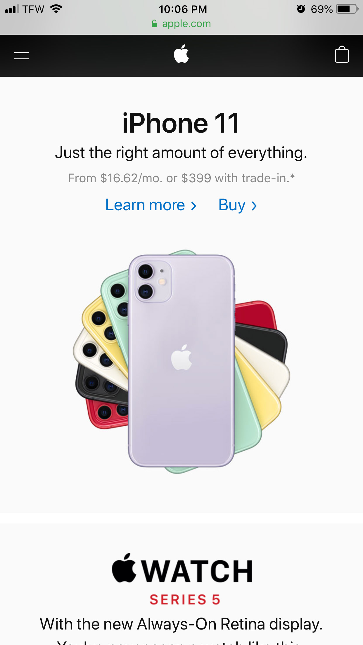
The Apple homepage uses white space and clean design to bring emphasis to the products. White space around the phones brings focus to the product, which is the main reason for visiting the website.The padding around the image and text allows the customer to focus on the clean design of the phones with their vibrant colors, before moving on to reading the text. The organized sequencing of the headings paired with an easy to read sans serif font helps give the page an overall clean feel.
Repetition
Ancestry
ancestry.com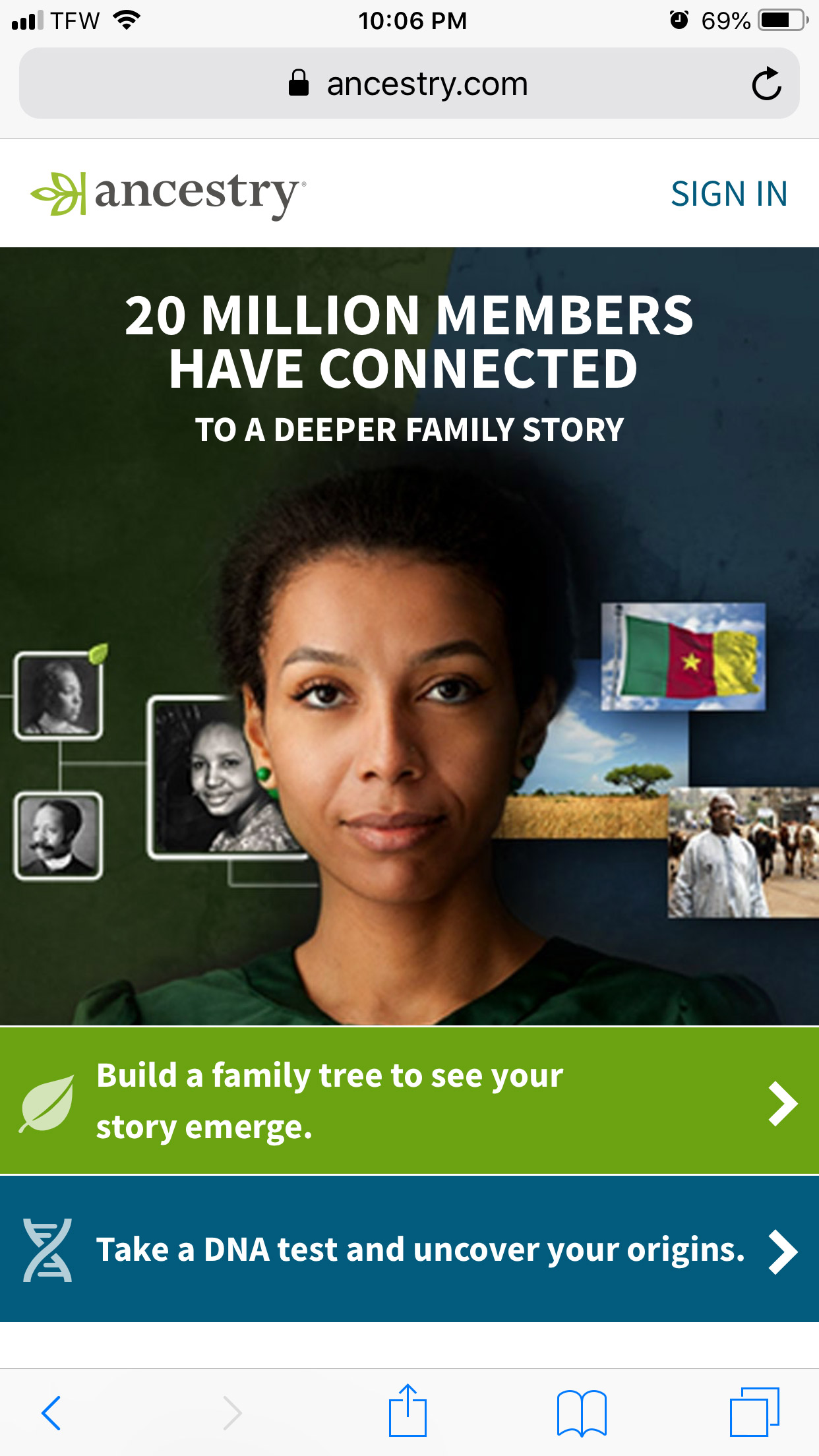
The Ancestry website uses repetition with colors and shapes. The Ancestry logo uses green and a very dark color. Those two colors are repeated throughout the site. Green is seen in the link at the bottom, the small leaf, the flag, the woman's earrings, dress, and the photos. Blue is used in the bottom link, and coordinates with the photos. The dark color from the logo matches the background and other colors throughout the page. The repeating pattern of squares and their white borders match the body text and navigation area. The repeating colors and shapes give the website a cohesive design.